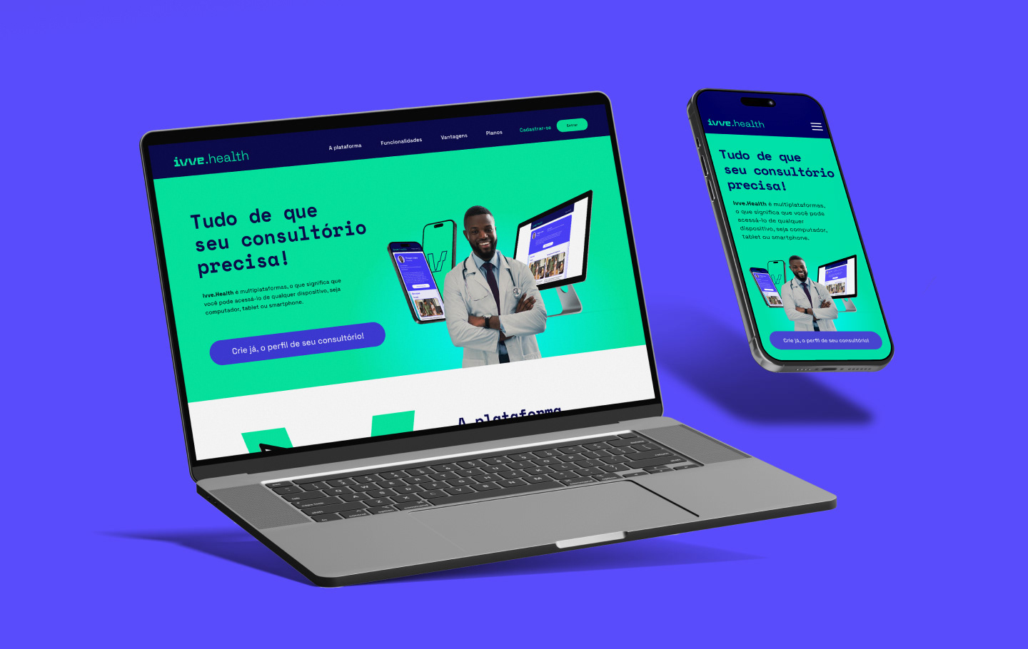
Ivve.health is an online appointment management and scheduling platform that empowers healthcare professionals and clinics to create customized landing pages to showcase their services and streamline their operations.
Goals
The primary goal of this project was to enhance the user experience during the onboarding process, specifically optimizing the registration flow and the initial customization of professional pages.
Challenge
The challenge involved designing a high-converting landing page and an intuitive onboarding flow to guide users through account creation. Additionally, I was tasked with aligning the entire visual interface with the brand’s new Style Guide to ensure visual consistency and authority.
Target Audience
The platform serves independent practitioners and healthcare clinics. Our improvements were specifically tailored for healthcare providers, receptionists, secretaries, and office assistants—those responsible for managing daily schedules.
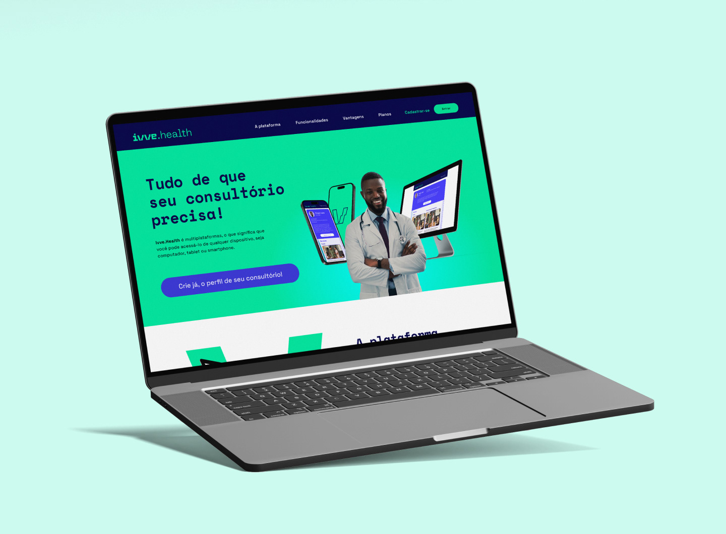
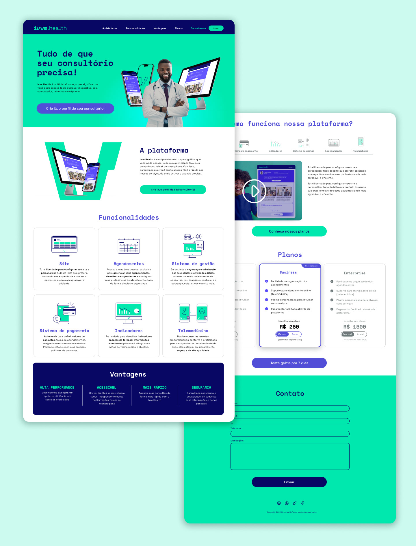
Old Version
Research
Since the system was already live, we conducted moderated qualitative research. Our objective was to pinpoint the friction points preventing users from completing their registration and fully setting up their profiles.
Pain Points
Through our research, we identified several critical friction points:
Incomplete Segmentation: The "Profession" field in the registration form did not adequately cover the specificities and diversity of healthcare specialists.
Scheduling Complexity: Setting up work shifts was a major source of confusion, particularly for professionals with flexible or non-traditional hours.
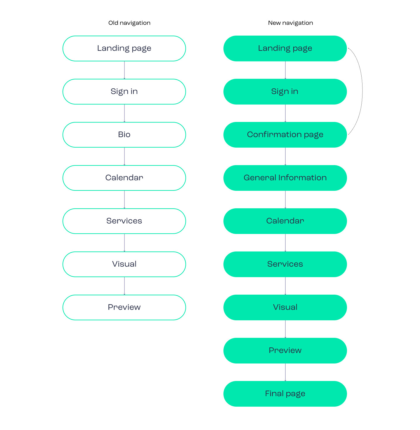
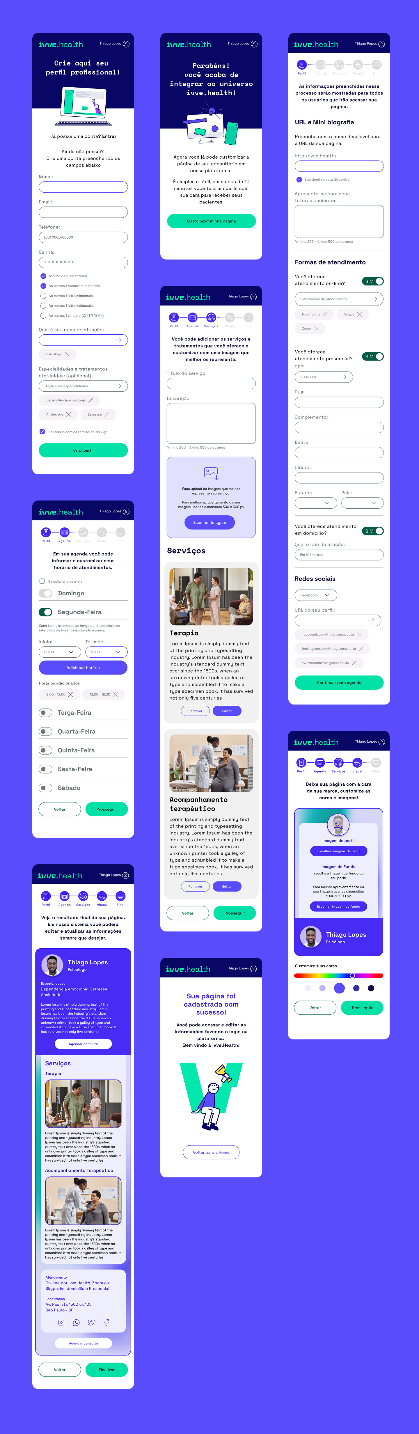
Lack of User Autonomy: The transition between registration and page customization lacked clarity. The flow forced users to complete design steps immediately rather than allowing them to finish later.
Contextual Dissonance: The final preview used generic placeholder text and terms unrelated to the user's specific field, making it difficult for them to visualize the end result.
Premature Paywall: Forcing users to enter credit card information to access the 7-day free trial caused significant drop-off at the end of the process.
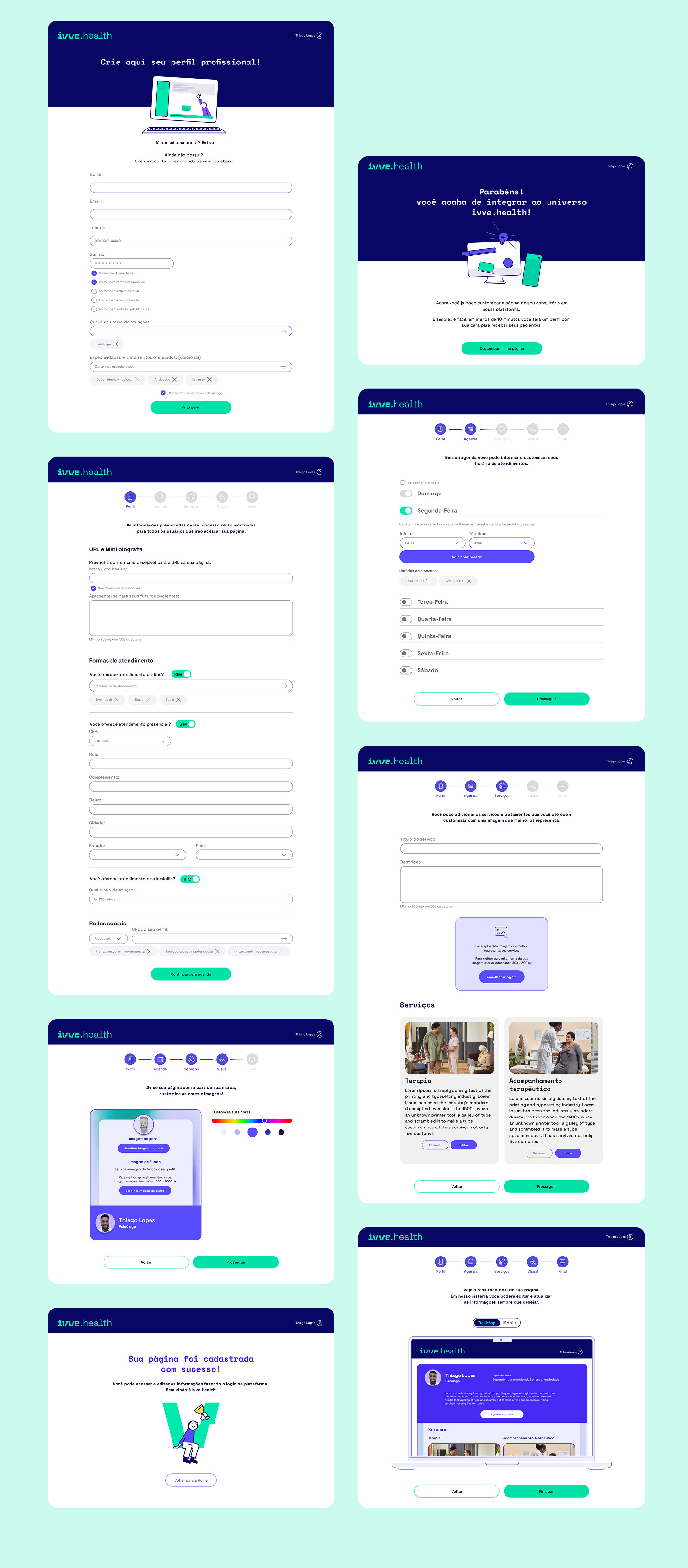
Sitemap & Solution
To address Pain Point 3, we restructured the navigation flow by adding a registration confirmation page. This provides users with the choice to either proceed with page customization immediately or skip to the dashboard and return to setup at a more convenient time.
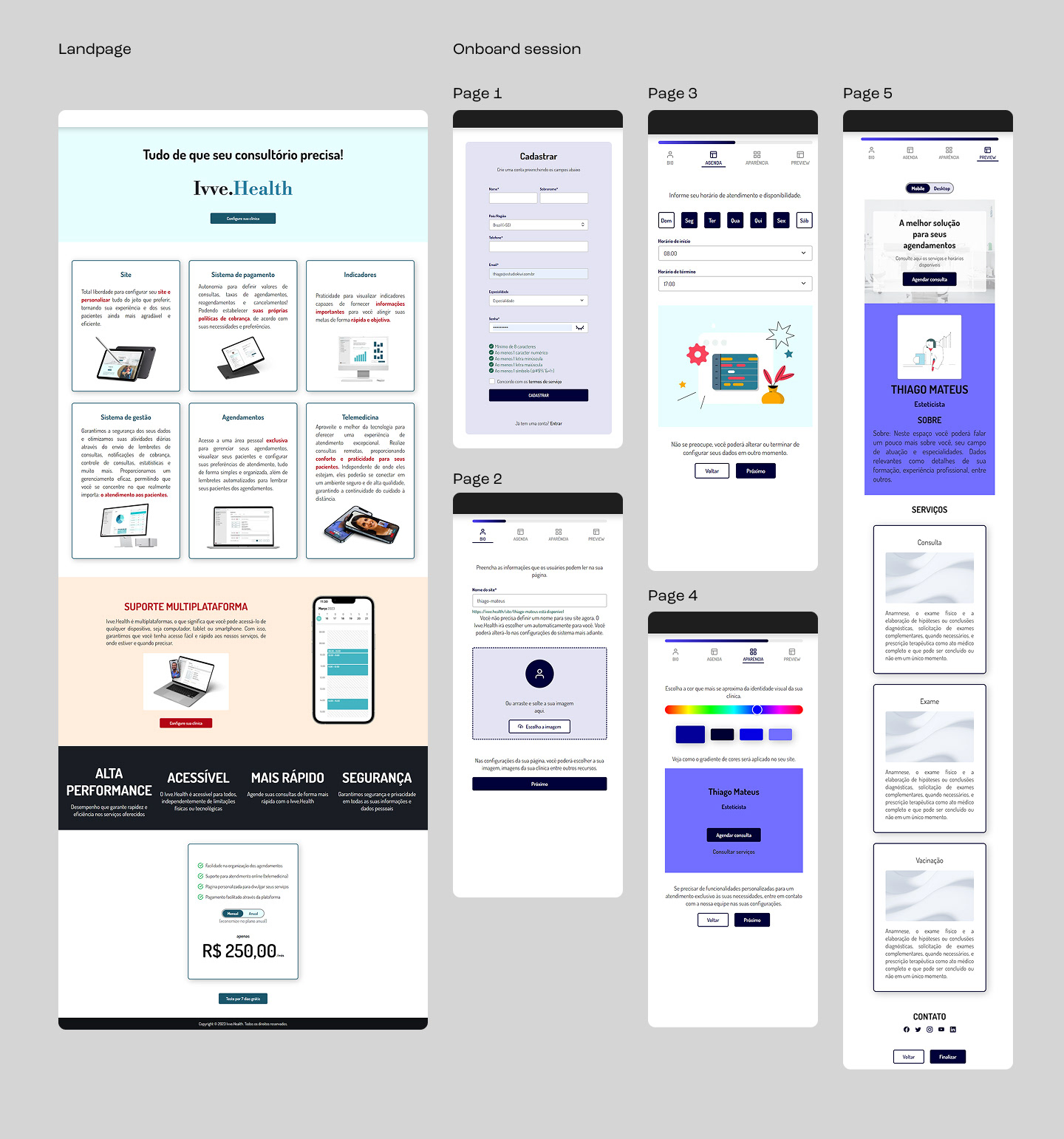
Wireframe
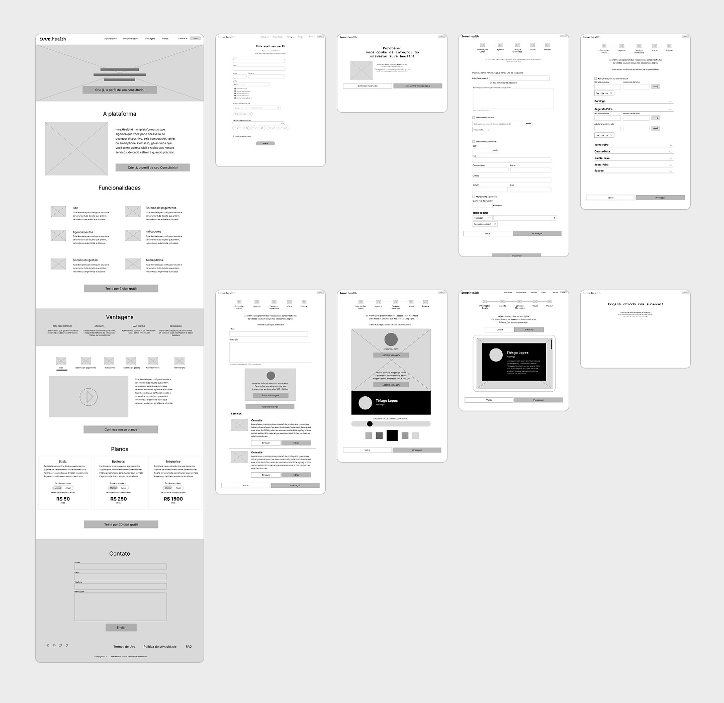
Landing page
Onboarding
Landing page mobile version
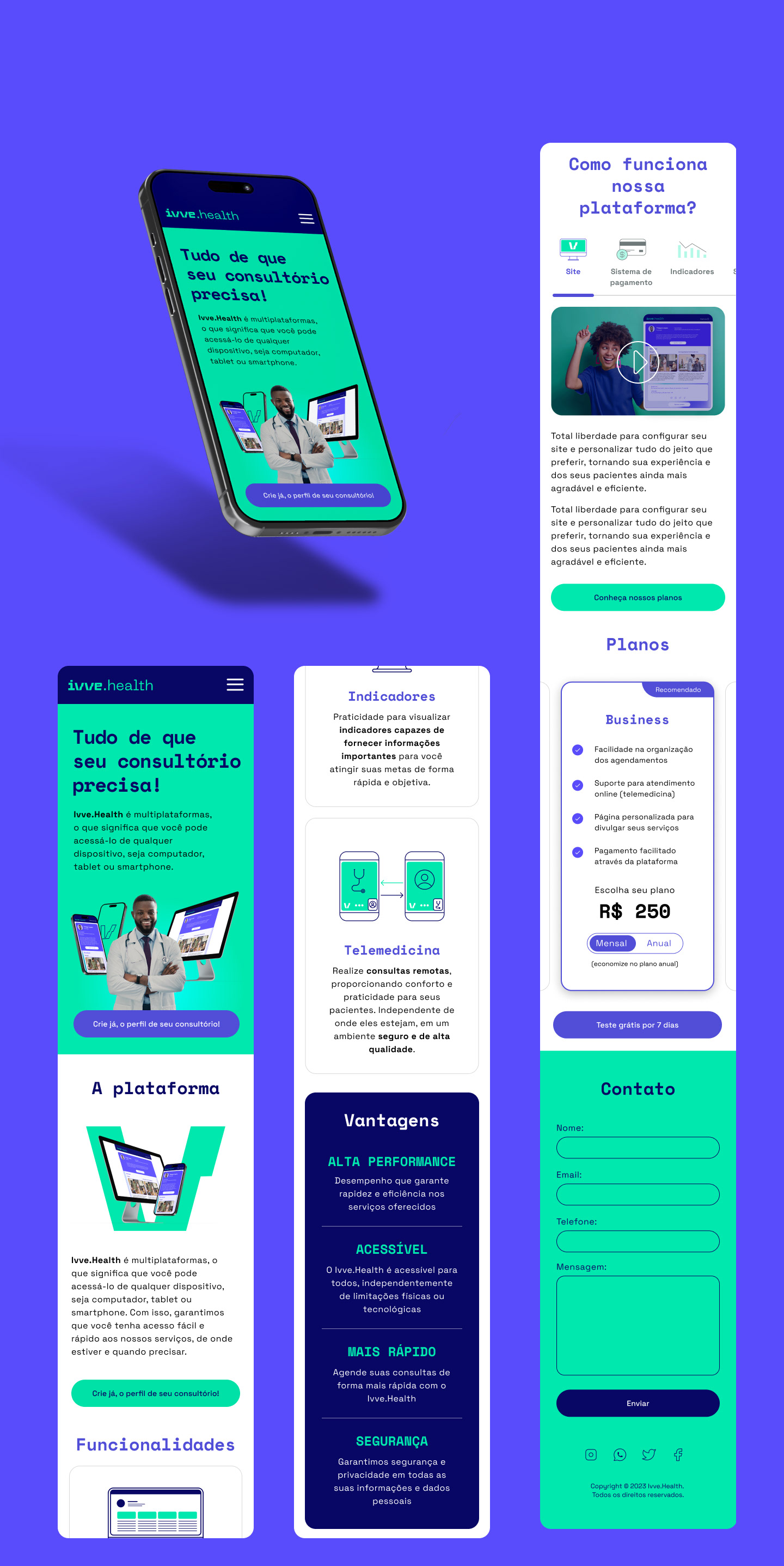
Onboarding mobile version
Results & Impact
By addressing the friction points in the onboarding flow, we achieved a more user-centric experience:
Higher Conversion: Removing the mandatory credit card entry for the trial period led to a significant increase in new sign-ups.
Reduced Support Tickets: Clarifying the "Work Shift" setup reduced the number of help desk inquiries regarding schedule configurations.
Increased Engagement: The new "Customize Later" option improved the completion rate of the core registration, as users felt less pressured.
Key Learnings
Context is Queen: I learned that using industry-specific placeholders (instead of Lorem Ipsum) is vital for helping users feel a sense of ownership over their digital space.
Flexibility equals Trust: Providing users with the choice to skip complex steps creates a smoother psychological experience and builds trust early in the journey.